Okay, so imagine you’re building a website — and you want to give users an option to switch between light and dark mode, and you want to know How Can I Implement DarkMode in TailwindCSS v4 using Vite in React Project?.
Just like Instagram, YouTube, GitHub — they all offer it, right?
Today, we’re going to build that same thing — a Dark Mode toggle feature — using React, Vite, and the latest TailwindCSS v4.
And trust me, Tailwind v4 brought some major changes. So if you don’t follow the steps properly, dark mode might not work at all. Let’s do this step-by-step.
⚙️ Step 1: React + Vite + Tailwind Setup
If you don’t know how to install tailwind css in react vite project. I’ve already created a video on a React + Vite project with TailwindCSS set up.
Watch Video
If you don’t know how to set this up, I’ve made a full video on that already — I’ll drop the link in Watch Video , you can watch that first.
Folder Structure:
Now, in my vite.config.js, I’ve imported Tailwind and added the plugin like this:
					import { defineConfig } from 'vite'
import react from '@vitejs/plugin-react'
import tailwindcss from '@tailwindcss/vite'

// https://vite.dev/config/
export default defineConfig({
  plugins: [react(),tailwindcss(),],

})
In index.css, I removed all the boilerplate code and just added
@import "tailwindcss";
Also, I deleted App.css — we don’t need it anymore.
In App.jsx, I’ve written a simple div with some Tailwind classes, and inside it, an <h1> tag that says:
					import React from "react";

function App() {
  return (

    <>
      <div className="h-screen flex  flex-col justify-center items-center">

        <h1 className="text-center text-4xl text-white">DarkMode in TailwindCSS v4</h1>

      </div>
    </>
  );
}

export default App;
Cool. Now let’s enable dark mode from Tailwind’s official site.
🔍 Step 2: Enabling Dark Mode in Tailwind v4
So I went to the TailwindCSS website, searched for Dark Mode, and scrolled a bit. There, Tailwind shows how to enable dark mode globally.
There’s a one-line setting you need to add in index.css:
					@import "tailwindcss";

@custom-variant dark (&:where(.dark, .dark *));
Paste it under the config and you’re good to go.
Now to avoid repeating color values again and again, I made custom colors for both dark and light themes.
Like this:
					@import "tailwindcss";

@custom-variant dark (&:where(.dark, .dark *));

@theme {
    --color-primary: #0bdbb6;
    --color-primary-dark: #0d0d0d;
}
So now we can use bg-primary for light mode and dark:bg-primary-dark for dark mode — clean and simple.
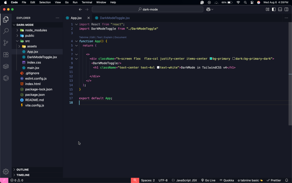
In App.jsx, I updated the div like this:
					import React from "react";


function App() {
  return (

    <>
      <div className="h-screen flex  flex-col justify-center items-center bg-primary dark:bg-primary-dark">
       <DarkModeToggle/>
        <h1 className="text-center text-4xl text-white">DarkMode in TailwindCSS v4</h1>

      </div>
    </>
  );
}

export default App;
🎯 Step 3: Making It Dynamic with a ToggleButton
Now if we manually add class="dark" on the root <html> element, the dark mode will work. But we don’t want that.
We want a toggle button to control it.
So I created a new file inside src folder called DarkModeToggle.jsx.
Inside it, I used rafce to create a basic React component. Then I imported useState and useEffect from React:
import { useEffect, useState } from "react";
Now let’s write the logic.
					const DarkModeToggle = () => {
  const [darkMode, setDarkMode] = useState(
    () => localStorage.getItem("theme") === "dark"
  );
Basically, we’re checking if the theme in localStorage is dark or not. So even after a page reload, the setting stays the same.
Then in useEffect, we apply or remove the dark class from <html>:
					useEffect(() => {
  const root = document.documentElement;

  if (darkMode) {
    root.classList.add("dark");
    localStorage.setItem("theme", "dark");
  } else {
    root.classList.remove("dark");
    localStorage.setItem("theme", "light");
  }
}, [darkMode]);
Then we return a simple button:
					return (
  <button
    onClick={() => setDarkMode((prev) => !prev)}
    className="px-4 py-2 mb-5 rounded-md bg-gray-200 dark:bg-gray-800 text-gray-500 dark:text-white shadow"
  >
    {darkMode ? "☀️ Light Mode" : "🌙 Dark Mode"}
  </button>
);
🧩 Final Step: Import the Toggle in App.jsx
Just import and use it like this:
					import React from "react";
import DarkModeToggle from "./DarkModeToggle"

function App() {
  return (

    <>
      <div className="h-screen flex  flex-col justify-center items-center bg-primary dark:bg-primary-dark">
       <DarkModeToggle/>
        <h1 className="text-center text-4xl text-white">DarkMode in TailwindCSS v4</h1>

      </div>
    </>
  );
}

export default App;
Now click the button — and boom! It works ✔︎
You’ll see the background and text color change.
And even after refreshing, the mode stays the same.
🧠 One Small Mistake I Made…
At first, it wasn’t working. I had a typo — wrote omclick instead of onClick. 😂
Also, I forgot to remove the dark class inside the else block.
Once I fixed that, everything worked perfectly.
and if you have also stuck in any step like tailwind css v4 not working react vite
🎁 Want More Beautiful UI Projects?
If you liked this, and want a fully customizable, real-world project —
I’ve built a complete Restaurant Management System that uses this same dark mode logic and more. Also, check this out: Event Management System.
You can download the full
Source Code for Indian users — Download Now
Source Code for International users — Download Now
🔥 Download All Frontend & Mern Stack Projects at Once – Worth ₹1,149, Yours for Just ₹699!
💡 Grab the complete bundle and save ₹450 instantly – One-click download, lifetime access!
How to add dark mode in Tailwind v4?
Okay, so Tailwind v4 made things even cleaner,Now you can add dark mode using this single line of code.
@custom-variant dark (&:where(.dark, .dark *));
Q2: Does ShadCN support Tailwind v4?
Yes, 100% — ShadCN UI already supports TailwindCSS v4.
In fact, it works even better now, because Tailwind v4 is lighter, faster, and uses smarter CSS strategies under the hood.
If you’re using shadcn/ui, just make sure you upgrade your Tailwind version in package.json, and re-run:
npx shadcn-ui@latest init
Q3: What is the default dark mode in Tailwind CSS?
By default, Tailwind uses "media" for dark mode — which means it follows your system settings (like light/dark mode in your OS).
But for full control, it’s better to change it to:
					@import "tailwindcss";

@custom-variant dark (&:where(.dark, .dark *));

@theme {
    --color-primary: #0bdbb6;
    --color-primary-dark: #0d0d0d;
}
Q4: Does ChatGPT use Tailwind CSS?
No, ChatGPT itself doesn’t use Tailwind CSS, at least not publicly confirmed by OpenAI.
But Tailwind is hugely popular in the dev world, and a lot of ChatGPT-based frontend projects (tools, dashboards, landing pages) do use Tailwind — especially in side projects and indie tools.
So if you love ChatGPT and you love Tailwind… you’re in good company!
Q5: Is Tailwind v4 stable?
Yes, TailwindCSS v4 is fully stable and officially released.
In fact, it’s faster, lighter, and completely rebuilt using PostCSS-less architecture. No more slow builds.
The only thing to watch out for is: a few breaking changes if you’re coming from v3. Like purge/content becoming content, and new @theme usage.
So if you’re starting fresh or migrating, just follow the official upgrade guide — you’re safe.
Q6: How to make dark mode easier in Tailwind v4 — without spamming dark: everywhere?
Ahh yes — the classic headache: writing dark: in every single class.
Here’s the good news — you can totally avoid that spammy feeling by using Tailwind v4’s new @theme and custom variants.
Here’s what I use personally:
					/* src/app.css */
@import 'tailwindcss';

@custom-variant dark (&:where(.dark, .dark *));

@theme {
  --color-primary: #166534;
  --color-muted: #e5e5e5;
  --color-tertiary: #94a3b8;
  --color-surface: #ffffff;
  --color-accent: #64748b;
  --color-secondary: #dcfce7;
  --color-content: #0f172a;
  --color-background: #f8fafc;
}
Conclusion:
Implementing dark mode in a React + Vite project using TailwindCSS v4 is super beginner-friendly — as long as you follow the right steps. From setting up Tailwind’s new config to using a toggle button with localStorage, you now have a complete dynamic dark mode experience that feels modern and customizable. Perfect for your next portfolio or client project!
And hey — if you want more real-world, fully functional projects, check out my Restaurant Management System . It’s got all the bells and whistles — and the link’s waiting for you in the description.